Listing quality
6 of 7 areas need attention 14 content fixes below — the highest-impact ones are already in your action plan.
Photos
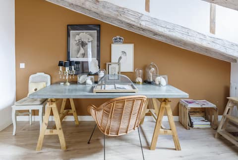
Needs work- Declutter the desk to two or three hero objects before reshooting, or promote Photo 12 (the airy white living room with exposed beams) to the cover — it reads immediately as a beautiful, inviting attic space at any thumbnail size.Photo 1 (cover) is shot from a slight distance and dominated by a cluttered desk surface — glass domes, scattered objects, multiple art pieces and a candelabra compete for attention. The warm ochre wall is attractive but the busy foreground makes it hard to read the space at thumbnail size, weakening click-through appeal.
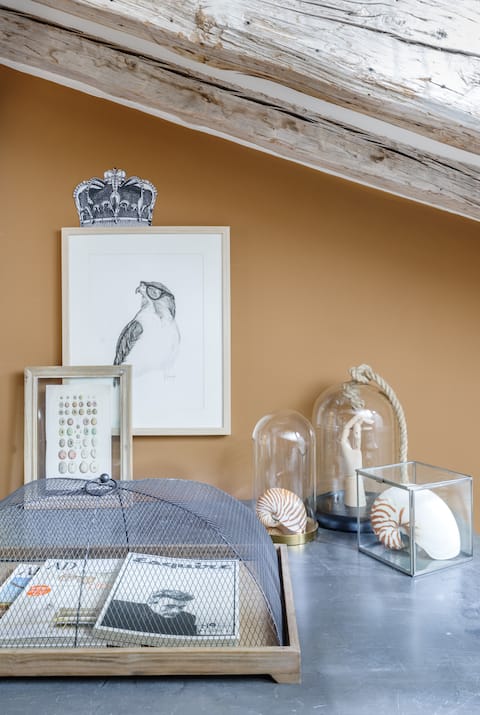
- Edit the vignette down to three to five intentional objects. Wipe the zinc desk surface and reshoot with consistent negative space so the rustic-chic aesthetic comes through cleanly.Photos 1 and 15 show the desk/workspace with an abundance of props — glass bell jars, shells, mesh cloches, framed prints, a candelabra — that read as clutter rather than curated styling, especially at small sizes.
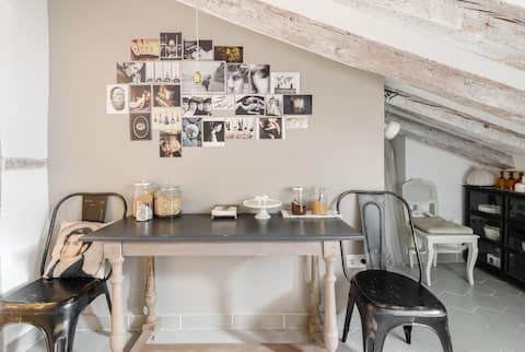
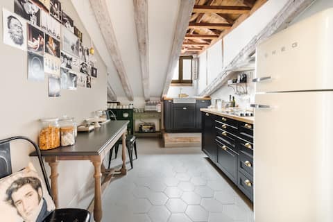
- Add a warm supplemental light source (a lamp or bounce flash) and reshoot during daylight to match the warm tone of the rest of the gallery. Ensure the photo-collage wall is neatly arranged and fully lit before shooting.Photo 7 (kitchen/dining area) has noticeably flat, cool ambient lighting compared to every other photo in the set. The Tolix chairs and table look dull and the photo collage wall is hard to read, making this otherwise characterful space feel uninviting.
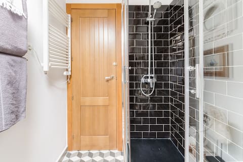
- Step back to include the full shower enclosure, the floor pattern, and any vanity or towel rail in frame. Use a wide-angle lens with a bounce flash or additional lighting to lift the dark tiles and show the space in its best light.Photo 17 (shower enclosure) is tightly cropped and shows only the door and the black-tiled shower stall — it gives no sense of the room's size or overall style, and the dark tiles with low light make it the least appealing photo in the set.
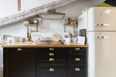
- Clear all countertop items except one or two styled props, then pull the camera back and reframe to show the full run of cabinetry, the Smeg fridge in its entirety, and the overhead shelves — this will read as a complete, well-equipped kitchen rather than a tight fragment.Photo 4 (kitchen close-up) is tightly cropped on the hob and drawers and cuts off the Smeg fridge awkwardly at the right edge. The countertop is also crowded with small appliances, condiment bottles and a phone, reducing the premium feel of the dark cabinetry.
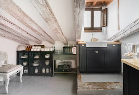
- Before photographing the kitchen, remove all food items and everyday clutter. Style the open shelving with a consistent set of matching crockery or curated objects. Reshoot both angles with warmer lighting to complement the wood countertop and aged-brass hardware.Photos 22 and 24 show the kitchen from different angles but both reveal the same styling inconsistency: open shelving with dishes stacked in a black display cabinet (photo 24) looks utilitarian rather than styled, and the countertop in photo 22 still has cereal jars, a honey pot, and various loose items that read as 'lived-in clutter' rather than intentional décor.
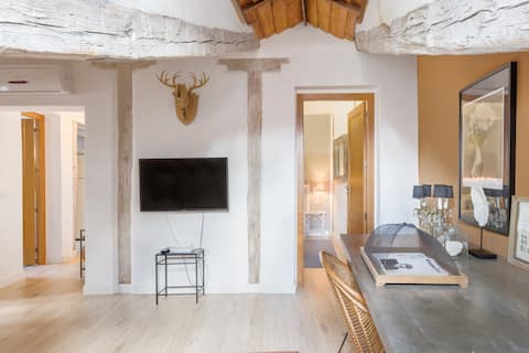
- Reframe to place the TV to one side and let the beautiful exposed-beam ceiling and the warm ochre room beyond the doorway become the compositional hero. Add a floor lamp or use a bounce flash to even out the left-side shadow.Photo 9 (hallway/living room transition) is composed around the TV mounted on the wall between two structural columns. A flat-screen TV is rarely an aspirational focal point; the shot is also slightly dark on the left side where the corridor recedes.
House Rules
Needs work- Revise the Additional rules text to remove the harsh eviction/no-refund language and replace it with a softer, informative tone about quiet-hours expectations.
- Correct the quiet hours discrepancy in the Additional rules free-text so it matches the toggle (10:00 PM - 9:00 AM) instead of stating 9:00 PM to 10:00 AM.
- Tone down the all-caps liability disclaimer paragraph to standard case and a more welcoming phrasing.
Consistency
Needs work- The Additional rules text states quiet hours are 'from 9:00 PM to 10:00 AM the following day', which contradicts the toggle rule 'Quiet hours — 10:00 PM - 9:00 AM' — align both to the same window.
Title
Watch- Suggested titlesHistoric Center Apartment by Royal PalaceReflects the description's 'historic center' language, targeting guests who value heritage and walkability without overstating positioning.
- Quiet Apartment Near Royal Palace, MadridLeverages the description's emphasis on tranquility ('ideal tranquility for rest') paired with the landmark, appealing to travelers wanting a calm base in a central location.
Search keywords
Watch- Work these into your title or description — only if they are true of your home:sustainable
Description
WatchWord Count. 961 words — well above the 300-word target, so length is not a concern, but a portion is spent on repeated details (surface area/floor mentioned twice, key-replacement fee mentioned twice) and registration/legal numbers that add little marketing value.
Scannability. Mostly organized into labeled sections (The space, Guest access, Other things to note) with short paragraphs, making it fairly easy to skim, though some paragraphs run long with dense location listings.
Experience vs Features. Blends both — it paints some experiential moments ('at night, you can see the stars', 'enjoy your favorite recipes at our dining table') alongside plain feature lists (kitchen contents, amenity listing), leaning more feature-heavy overall.
Target Audience. Speaks broadly to travelers seeking a central, historic Madrid stay, with some appeal to remote workers ('ideal for work') and families (crib, high chair available), but no single guest type is clearly prioritized.